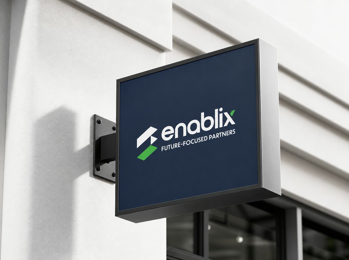
An IT partnership platform that needed to read as established from day one — a navy-and-green mark built to hold up on a laptop lid, a sign-in screen and a conference banner alike.
Enablix connects businesses to the IT partners they need, but the brand didn't read as trustworthy enough to sit in front of enterprise clients — no consistent mark, nothing that said "future-focused partner" instead of "startup."
Our job: build a mark disciplined enough for a laptop lid, a login screen and a trade-show banner alike, plus a system the team could apply to every new touchpoint without us.
Every decision made against the strategy, then handed over as usable tools.
Enablix now looks like the established partner it claims to be — the same mark on the laptop, the login screen, and the banner at a trade show. Consistency doing the trust-building work before a single conversation happens.
Prospects stopped asking if we were a real company. That question just doesn't come up anymore.