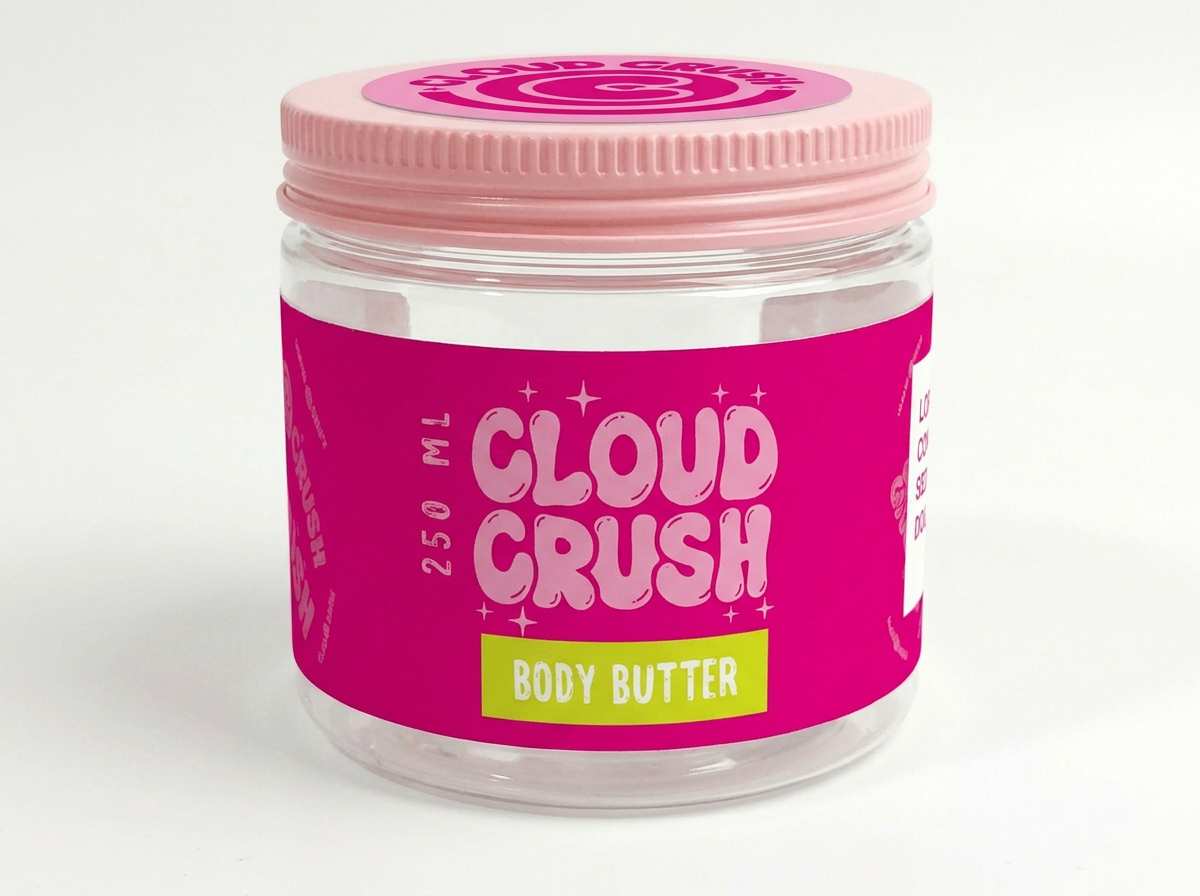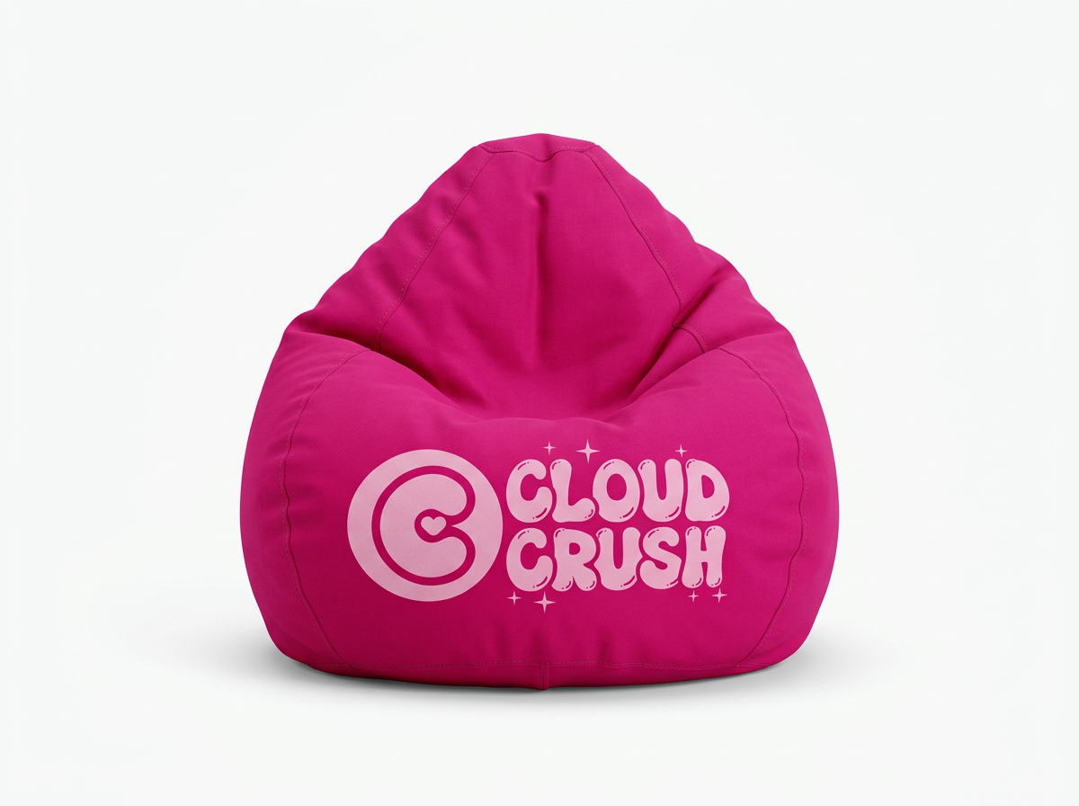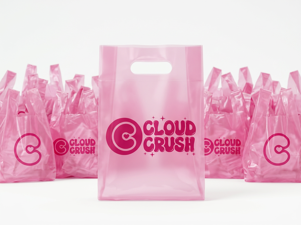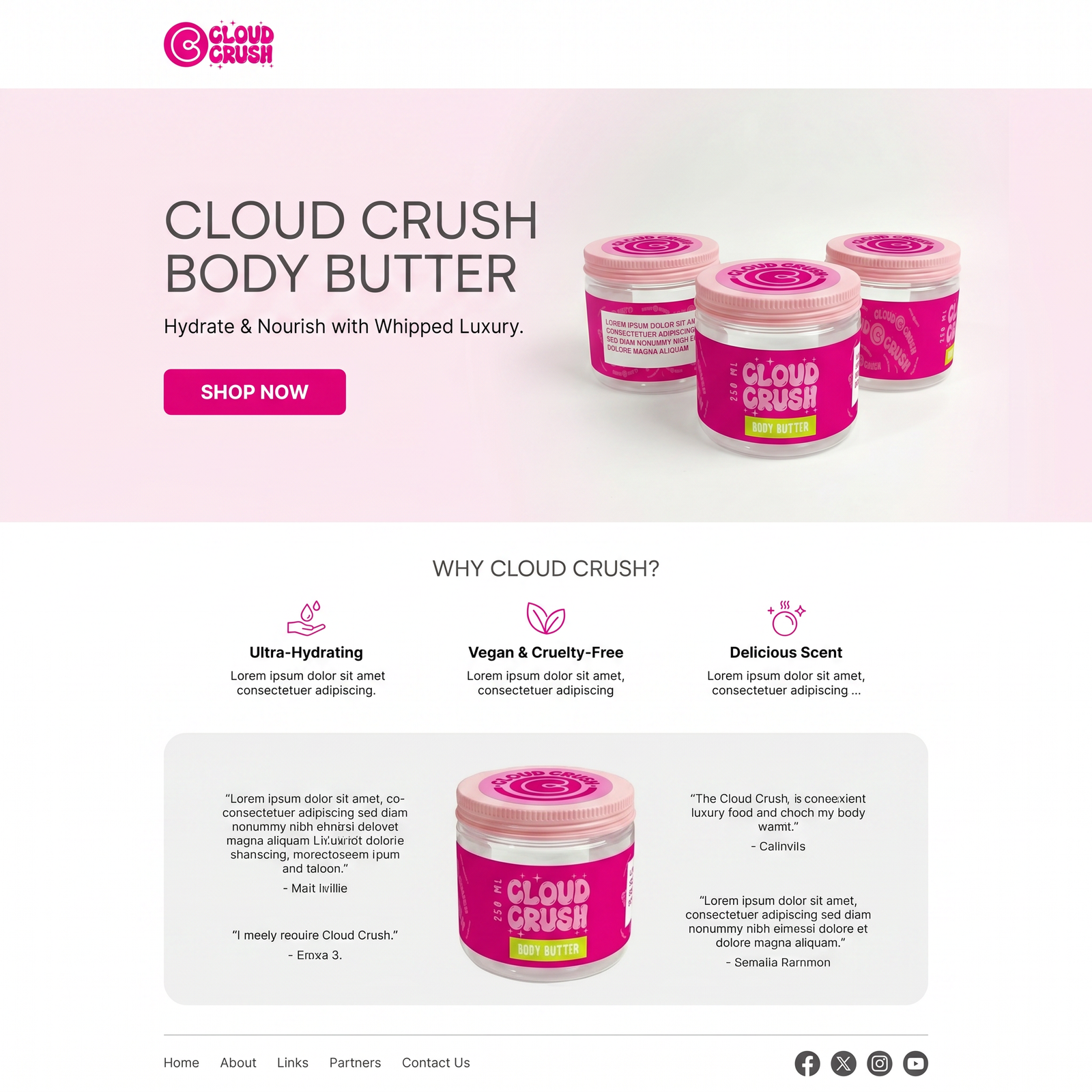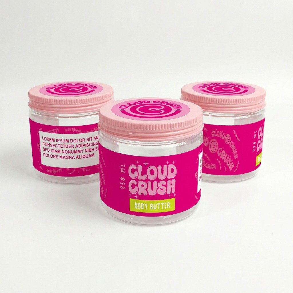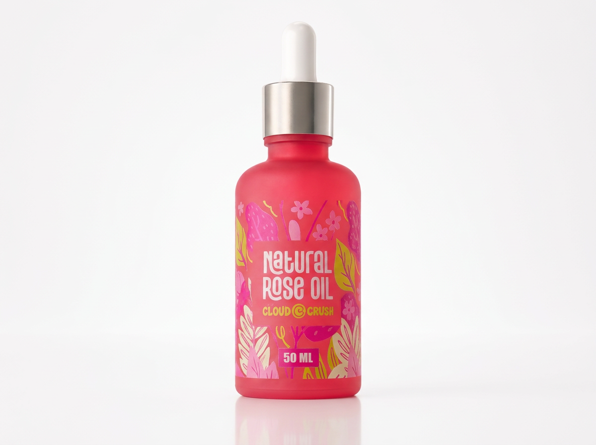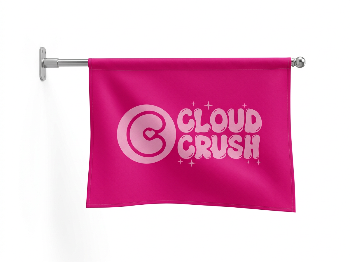
A whipped body butter brand built to feel like a treat — a playful hot-pink identity with a heart-in-a-swirl mark, and a packaging system that carries across the whole personal care range.
Cloud Crush had a genuinely luxurious body butter, but nothing about the old look said "treat yourself" — on a shelf full of clinical, minimal beauty packaging, it disappeared instead of standing out.
Our job: build a mark playful and confident enough to own hot pink, then apply it across a packaging system that could grow with the product line — from body butter to oils to merchandise.
Every decision made against the strategy, then handed over as usable tools.
Cloud Crush now looks exactly like what it is — a treat. The same playful hot-pink mark carries across the jar, the bag, and the new rose oil line, so growing the range never means starting the brand over.
Customers say the packaging alone makes it feel like a gift, even when they bought it for themselves.