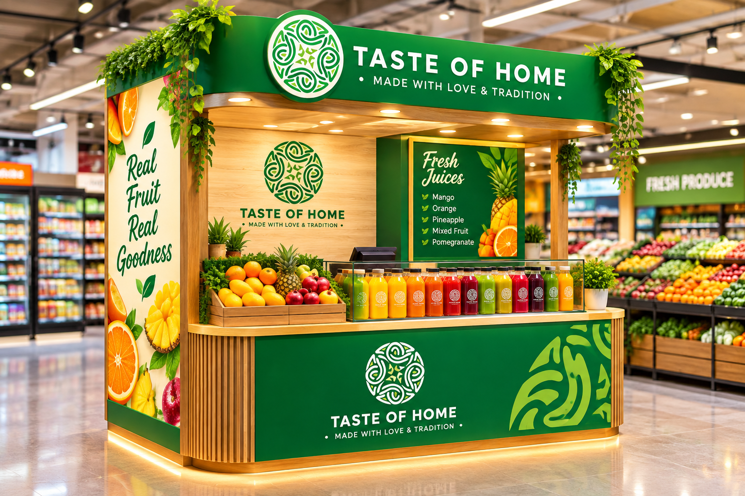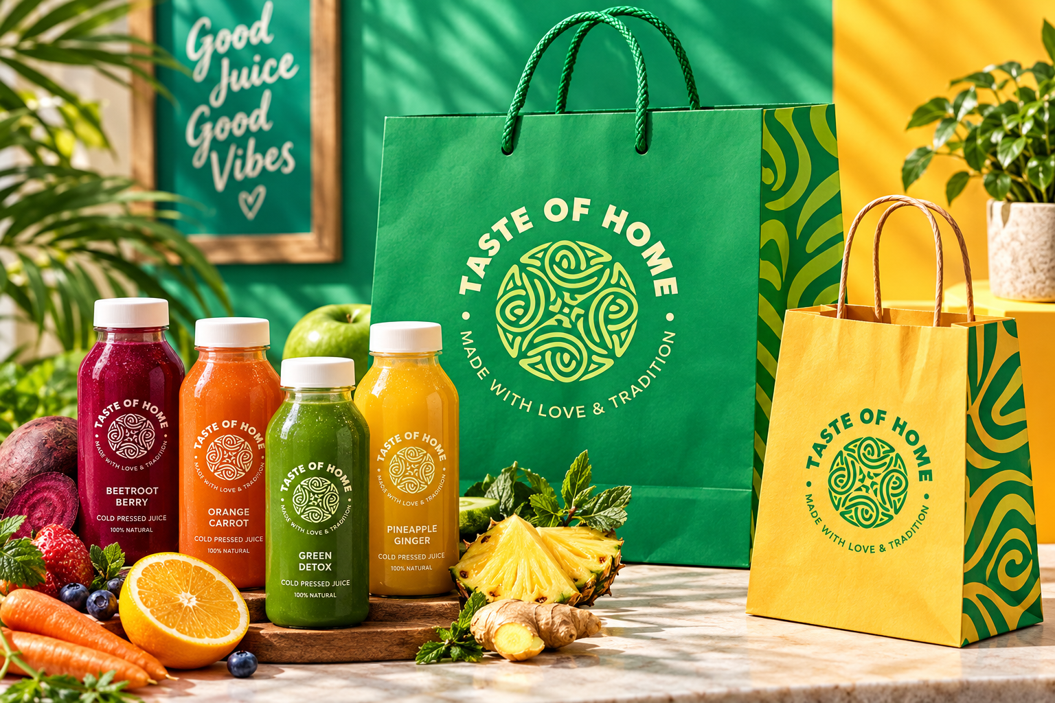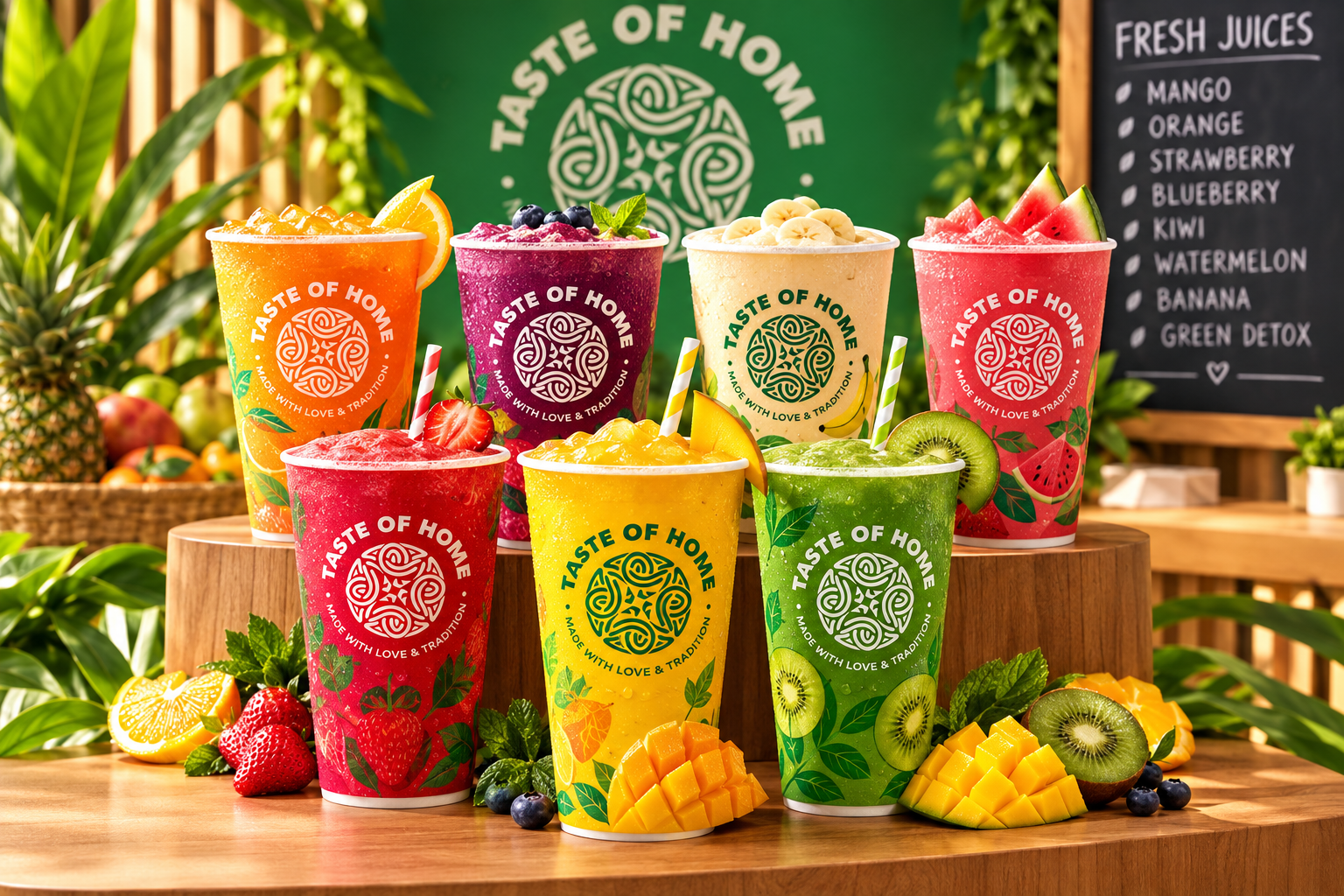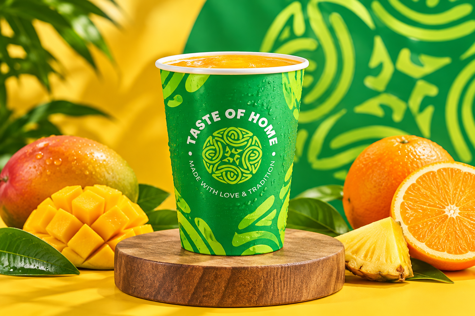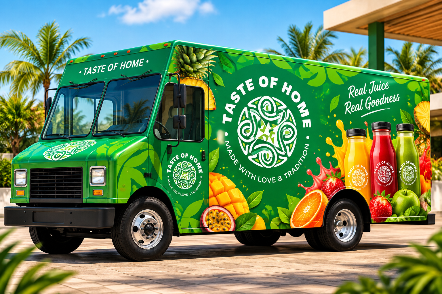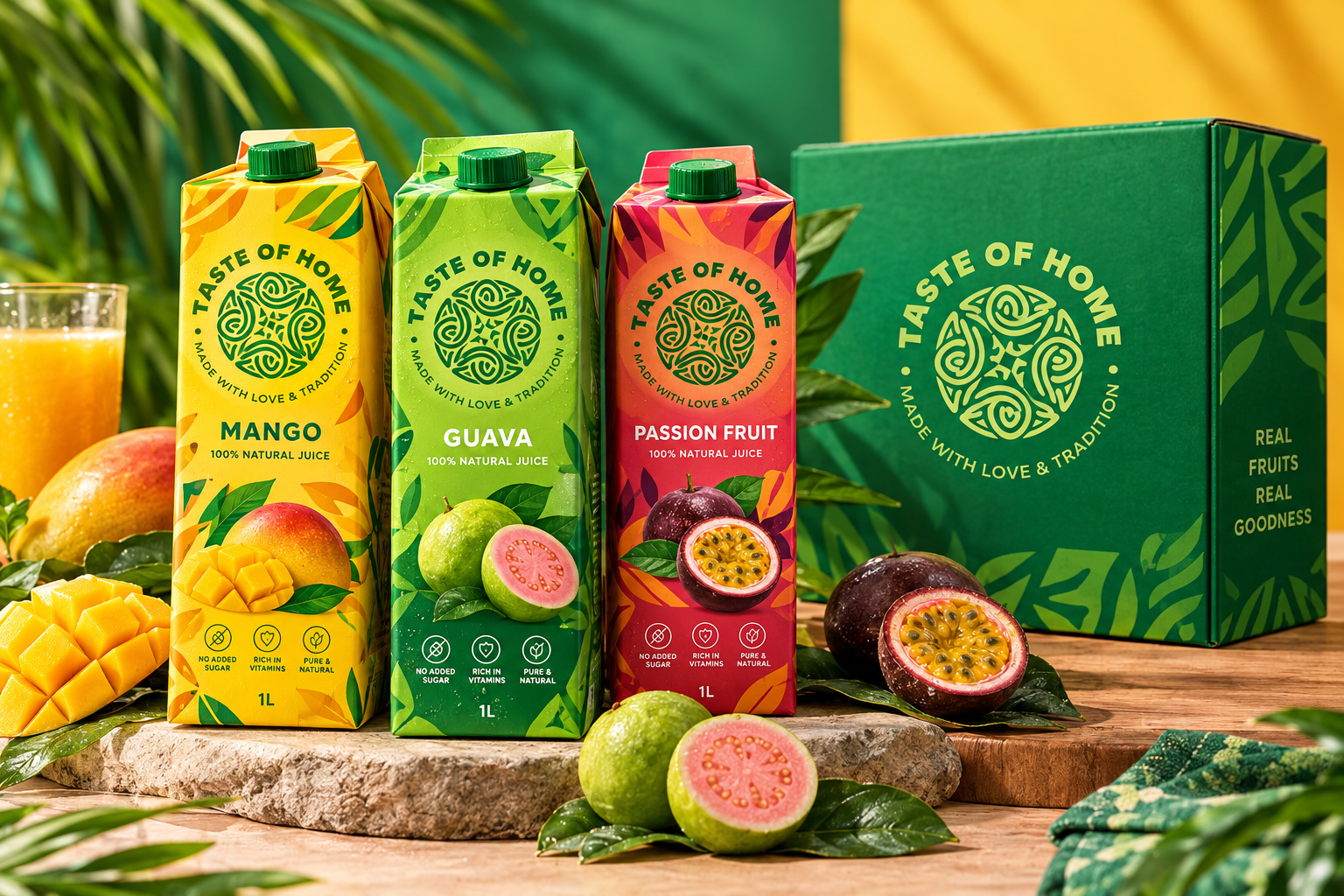
A fresh-juice brand built to travel — from a mall kiosk to a delivery truck to the bottle in someone's hand — a Celtic-inspired mark and a green-and-yellow system that reads "real fruit" from across the room.
Taste Of Home makes genuinely fresh juice and smoothies, but sat on a market shelf full of mass-produced cartons making the same "100% natural" claim as everyone else. Nothing set it apart at a glance.
Our job: build a mark distinctive enough to own at a distance, then apply it across an entire range — cartons, cups, bottles, bags, the kiosk, even the delivery fleet — without diluting it.
Every decision made against the strategy, then handed over as usable tools.
Taste Of Home now looks like one brand everywhere it shows up — the kiosk, the cup in your hand, the truck outside. The mark carries the "real fruit" story before a single word is read.
People spot our cup from across a food court now. That never happened before.