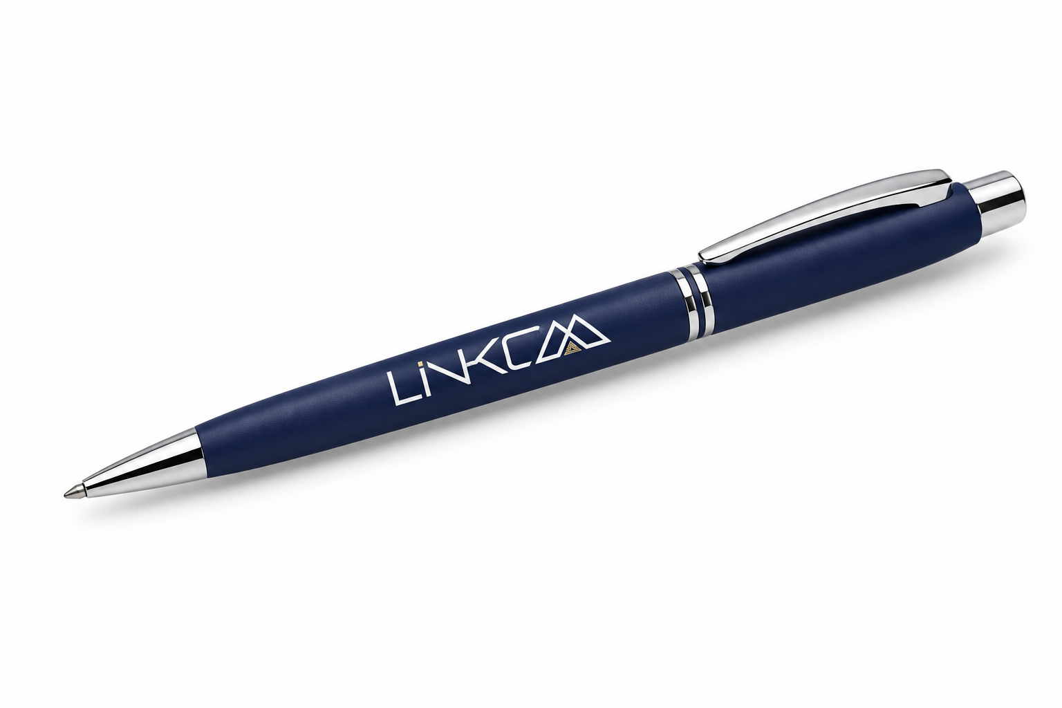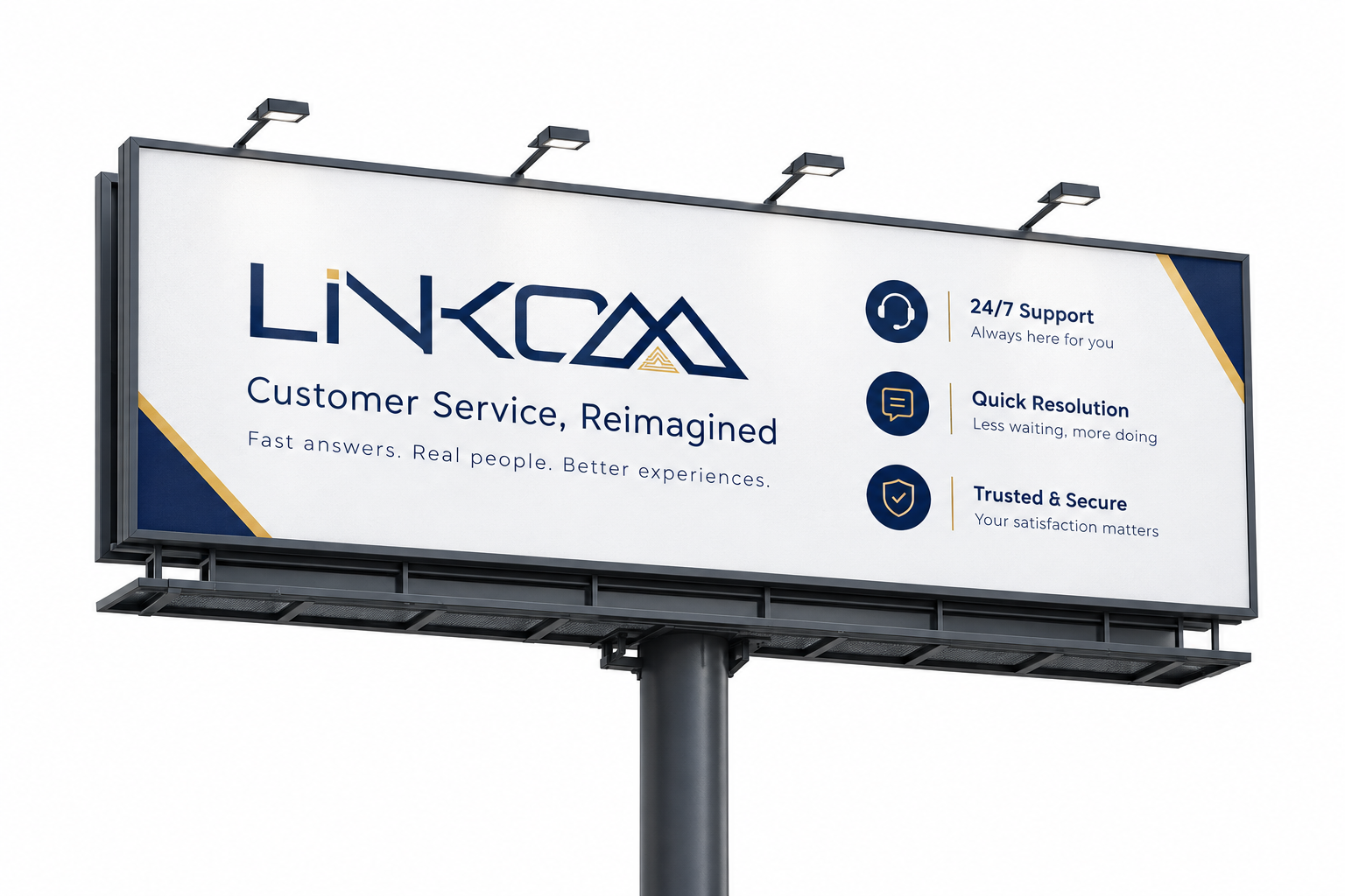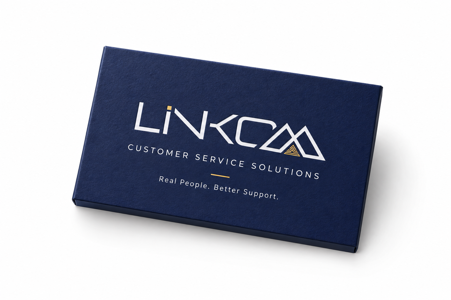
A rebrand for a customer service solutions company built around a simple promise — real people, better support — carried through a confident navy-and-gold mountain mark and a full stationery-to-billboard system.
Linkom's old mark didn't say "customer service" — it said nothing in particular, and it wasn't holding up across the stationery, merchandise and outdoor advertising the business actually needed.
Our job: rebrand it around what the company actually sells — real people, fast resolution, trust — and build a system disciplined enough to run from a notebook to a billboard without losing consistency.
Every decision made against the strategy, then handed over as usable tools.
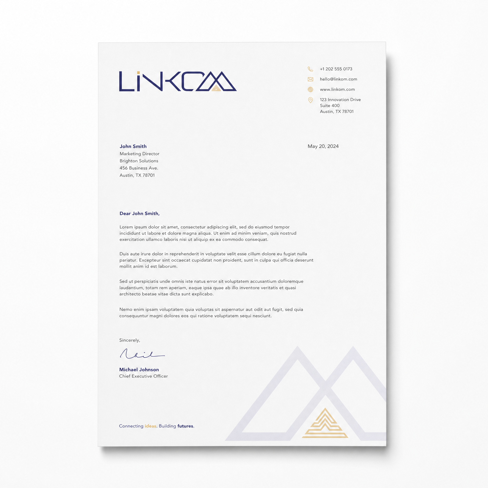
Linkom now shows up the same way everywhere — the billboard on the highway, the pen in a client's hand, the notebook on a desk. One mark, one promise, applied with discipline across the whole business.
Real people, better support — that's exactly who we are now, on every single touchpoint.