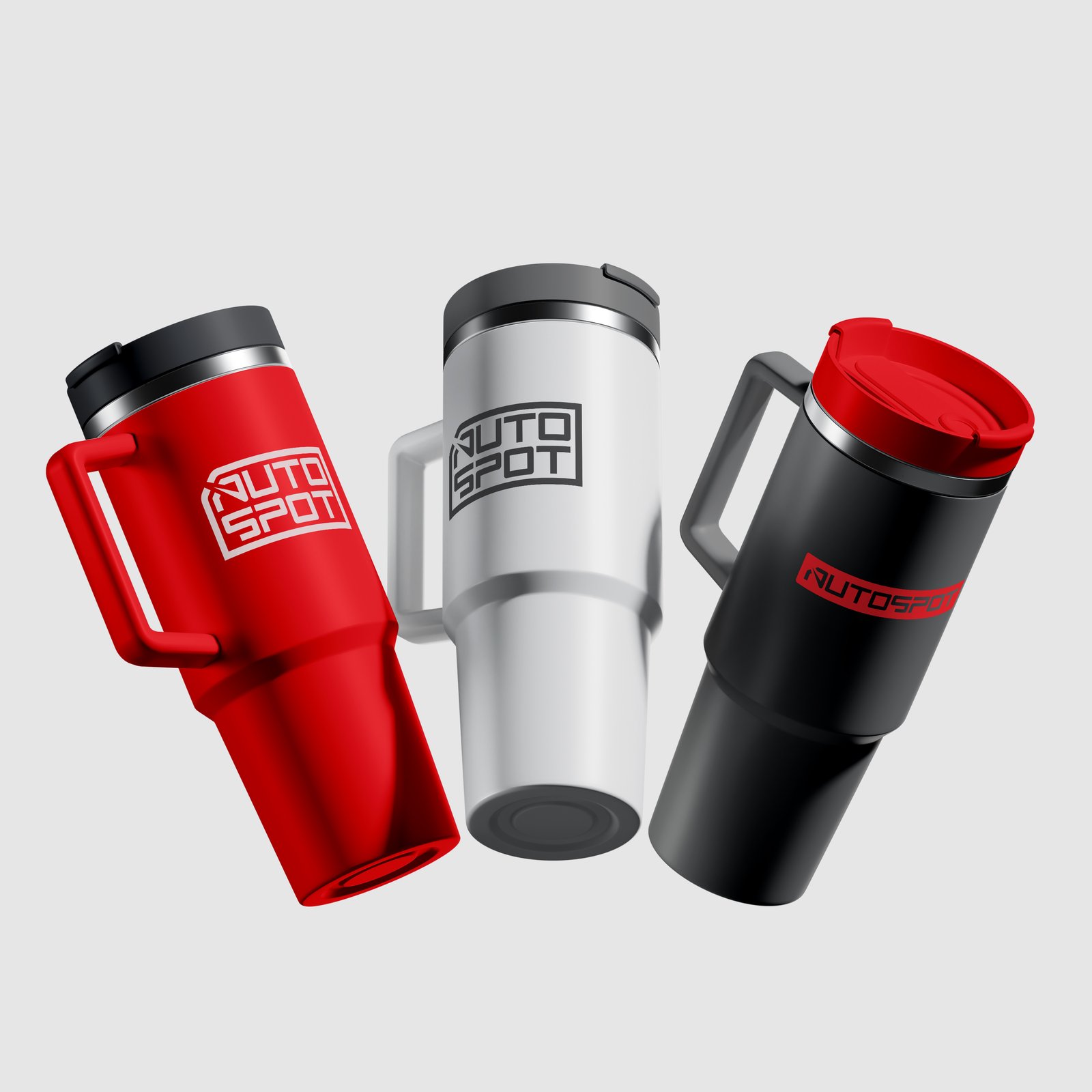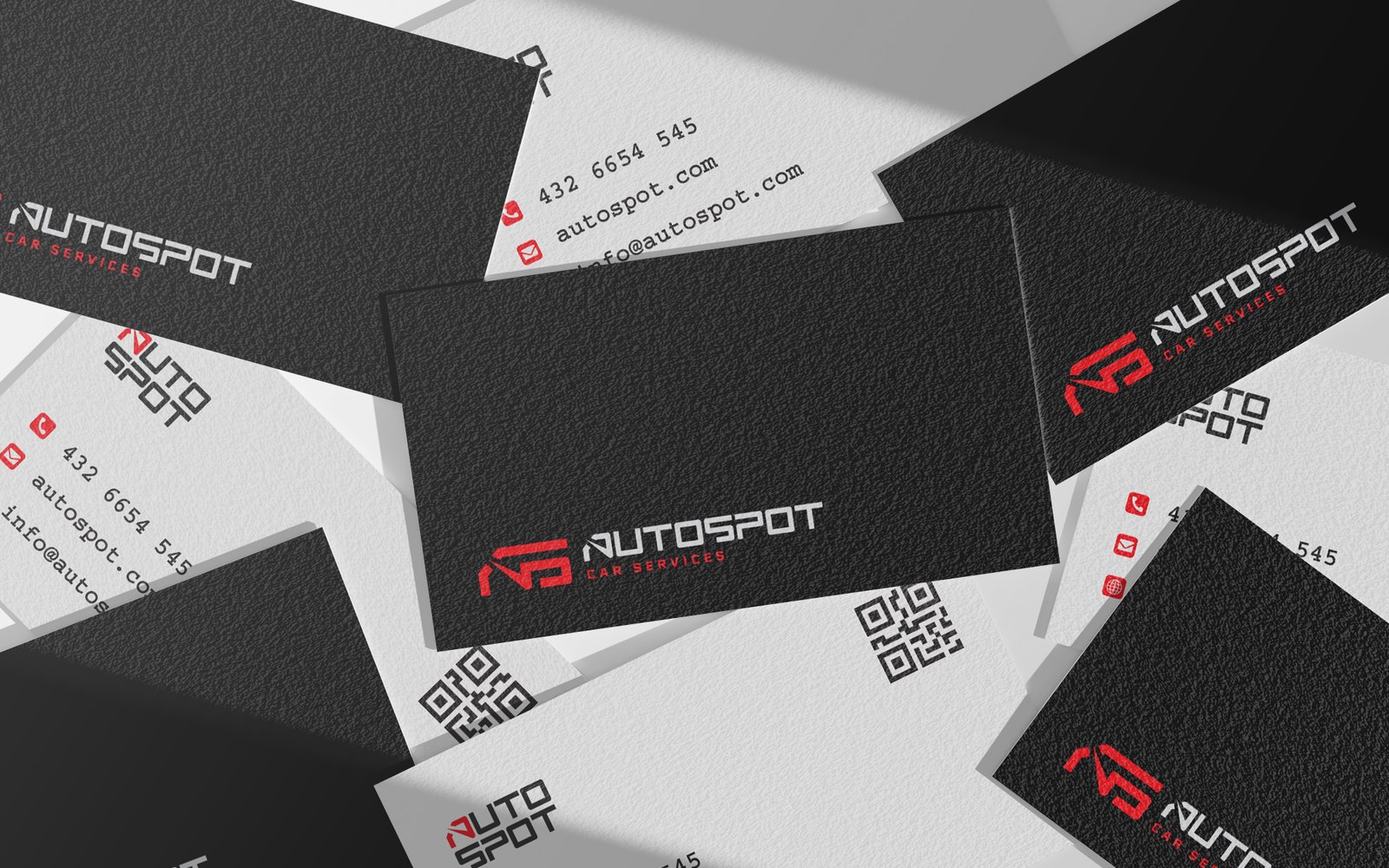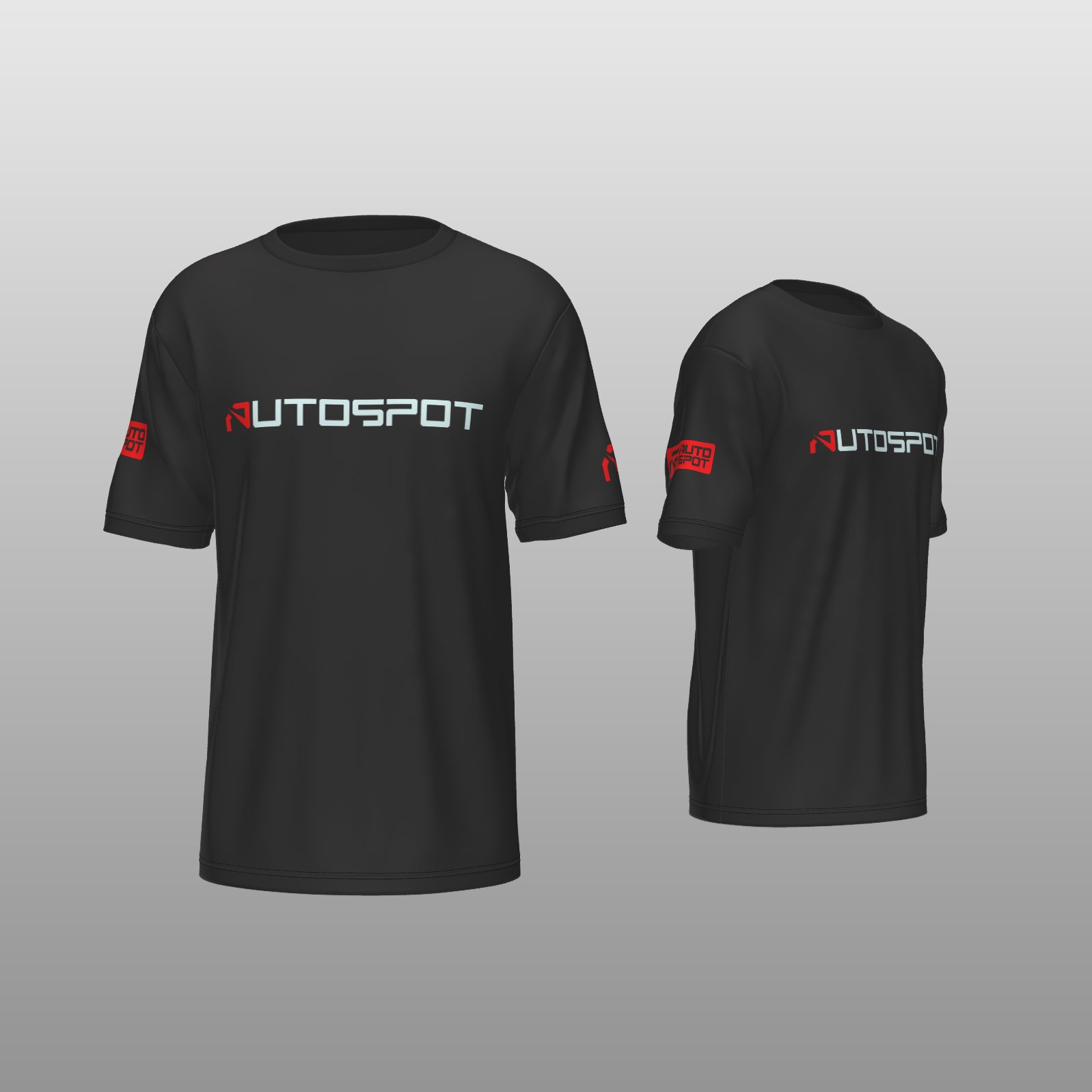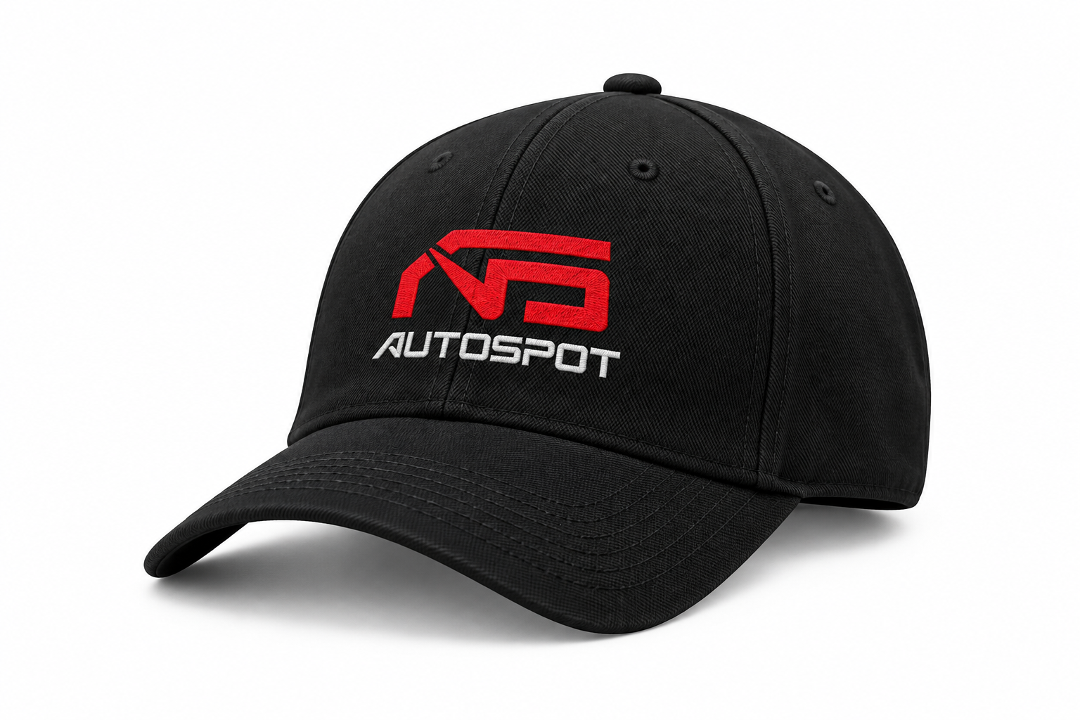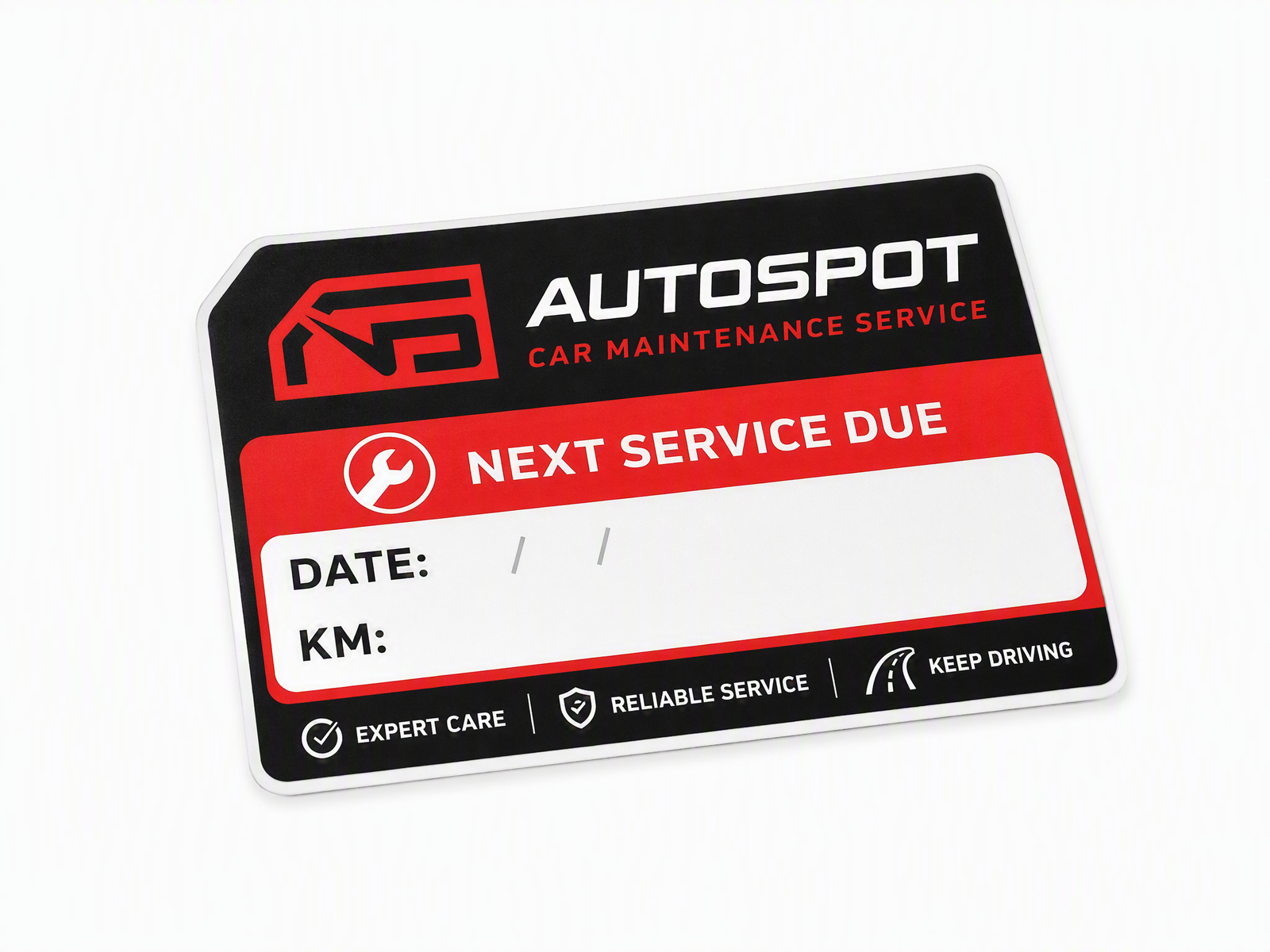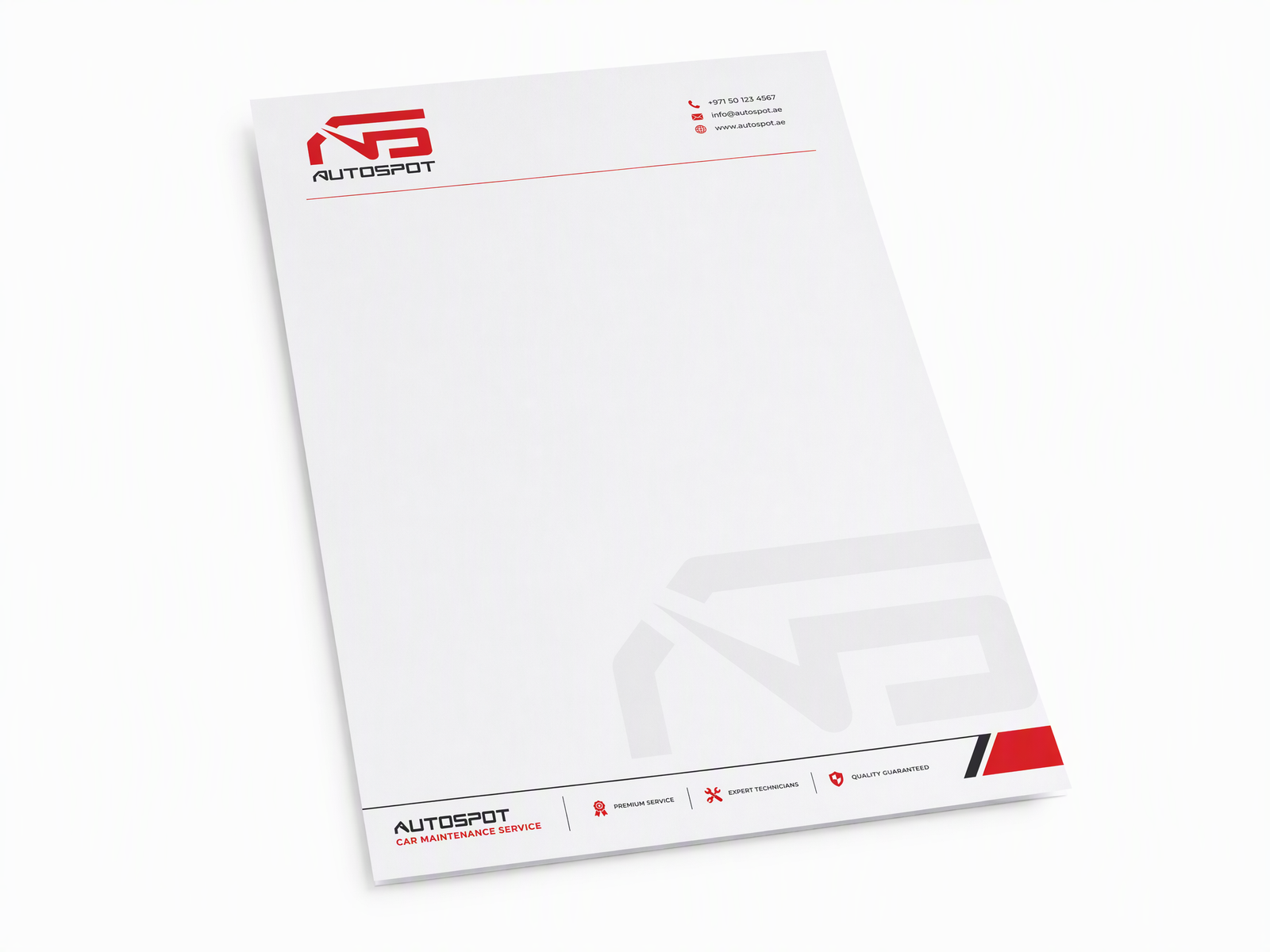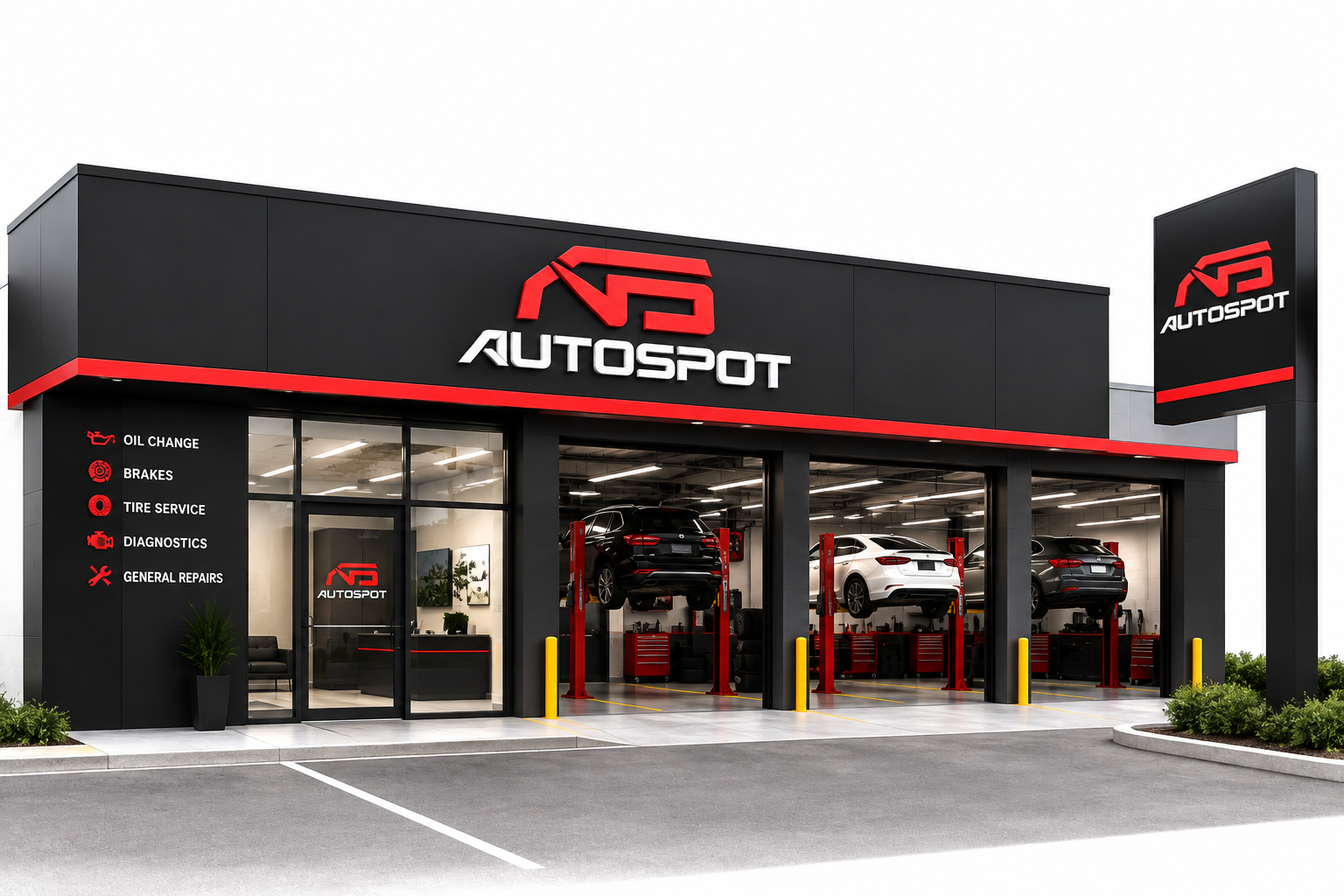
A car maintenance service that needed to feel like a proper garage, not a roadside shop — a sharp black-and-red mark and a system built to run from the storefront sign to the service reminder card.
Autospot does the unglamorous work well — oil changes, brakes, diagnostics, general repairs — but looked like every other garage on the street. Nothing said "trust us with your car" before a customer even walked in.
Our job: build a sharp, technical mark and a system that reads as professional everywhere a customer touches the business, from the storefront sign to the reminder card in their glovebox.
Every decision made against the strategy, then handed over as usable tools.
Autospot now looks like the professional operation it always was — the same mark on the storefront, the mechanic's cap, and the card that reminds a customer when to come back. Trust, built before a wrench is picked up.
Customers used to ask if we were legit. Now they just book the appointment.