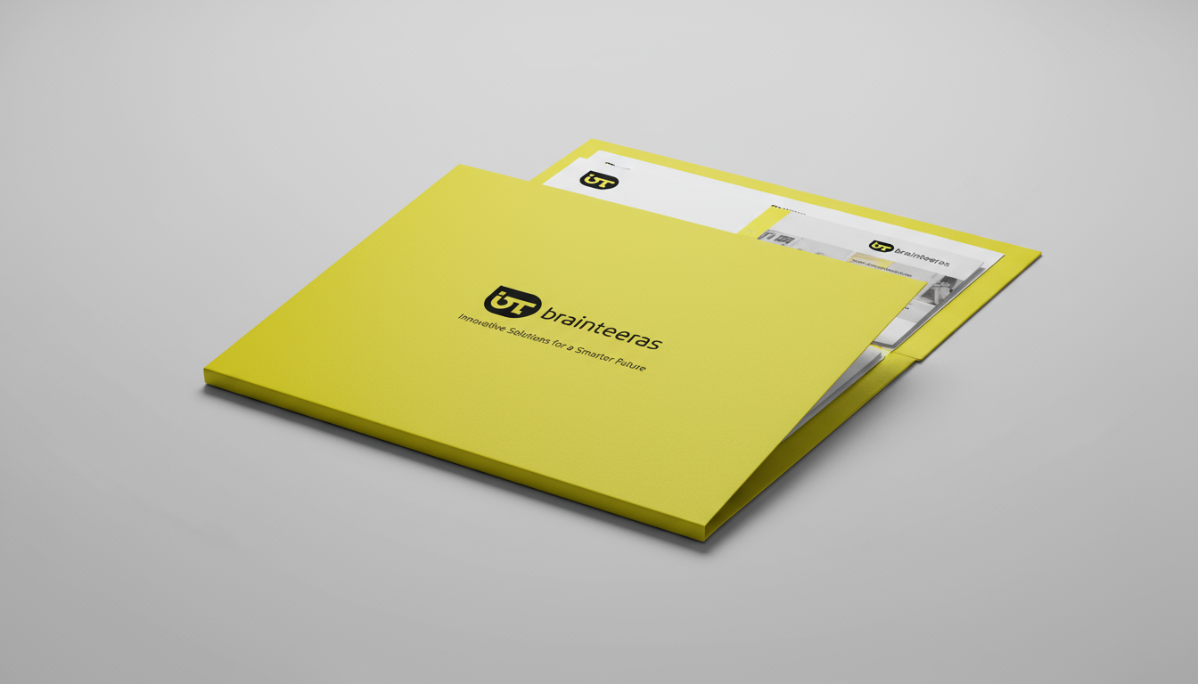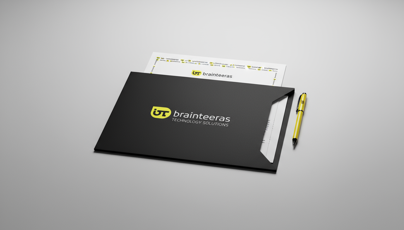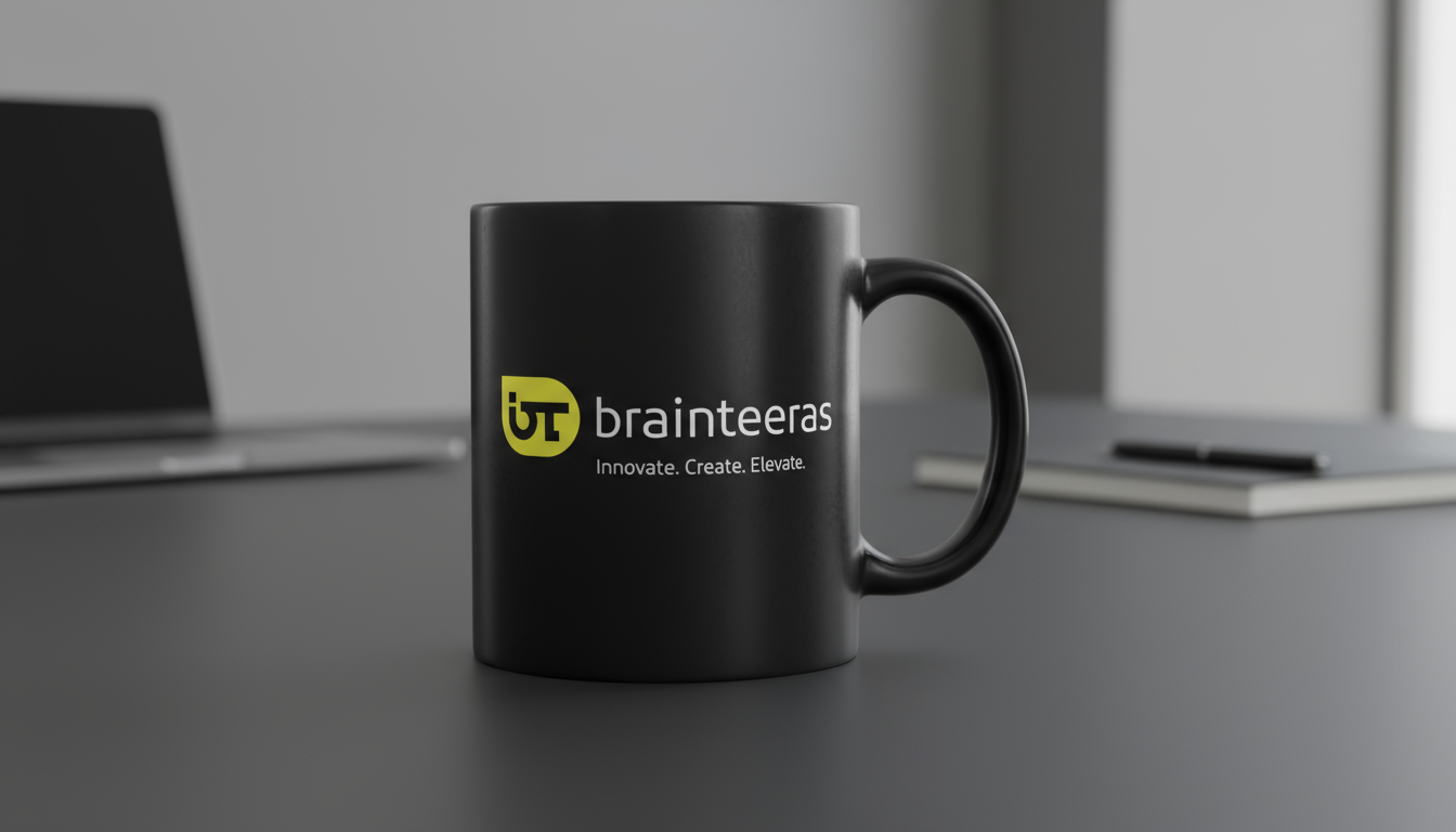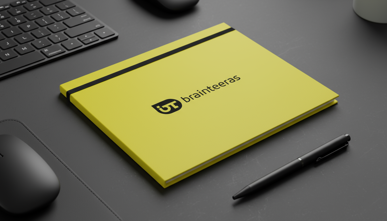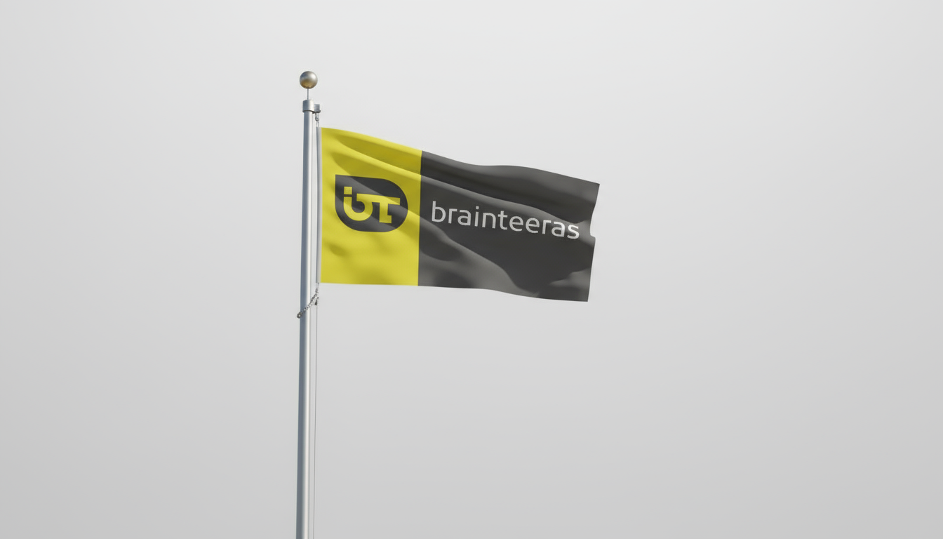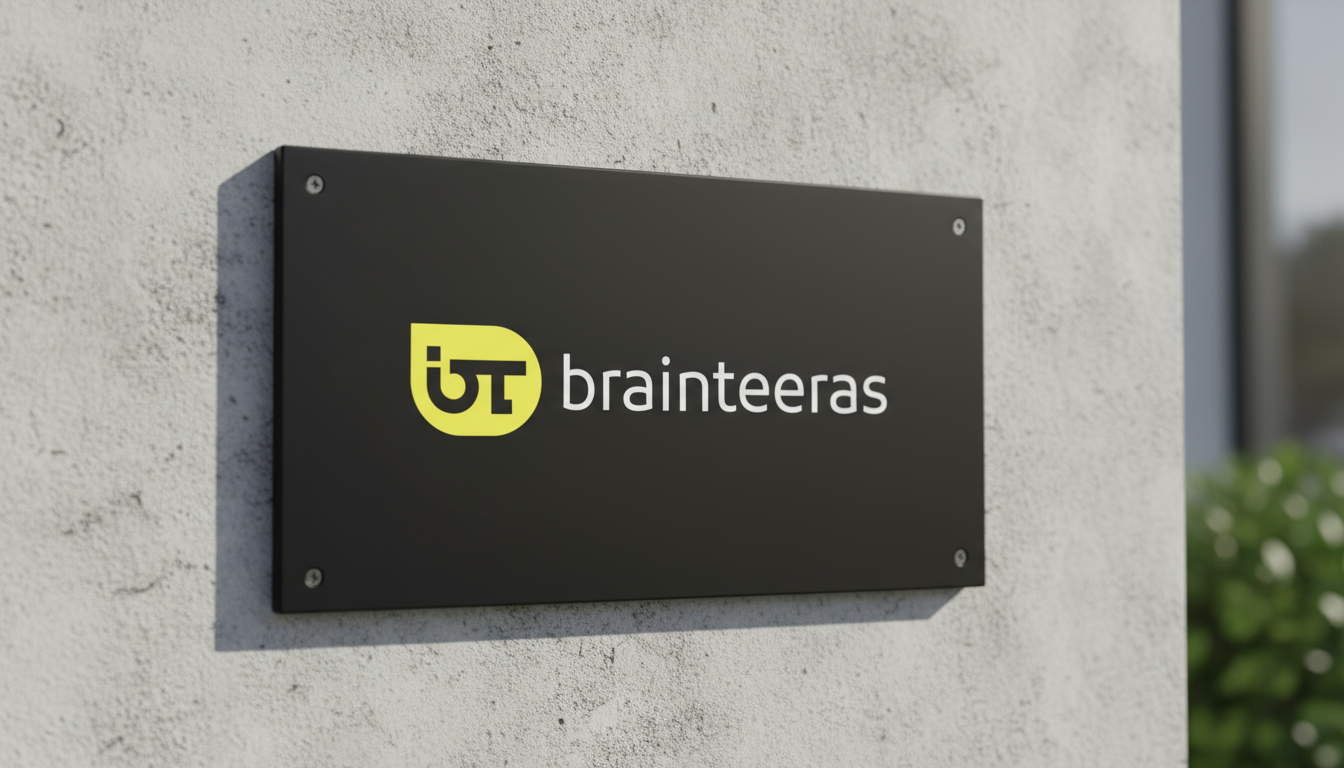
A technology solutions company that needed to look as sharp on a trade-show floor as it does on a business card — a bold yellow-and-black mark and a system built to run across print, merchandise and environments.
Brainteeras had solid technology and a name that photographs well on a folder, but no consistent mark to carry it anywhere — stationery, merchandise and a booth all looked like different companies.
Our job: build one confident mark, then apply it with discipline across everything the sales team actually hands people — folders, notebooks, flags, signage, and the trade-show floor.
Every decision made against the strategy, then handed over as usable tools.
Brainteeras now shows up the same way everywhere — the booth, the folder handed to a prospect, the notebook left on a desk. One mark, applied with discipline, doing the job a scattered identity never could.
We finally look like the company we actually are — and it shows the moment people walk up to the booth.